Civilization VII: UI Issues?

Civilization VII's Deluxe Edition launched just yesterday, and the internet is already buzzing about its UI and other perceived shortcomings. But is the online outcry justified? Let's delve into the game's interface and determine if the criticism is accurate.
← Return to Sid Meier's Civilization VII main article
Is Civ 7's UI as Bad as They Say?
With only Deluxe and Founder's Edition players having access to Civ VII for a day, the game is already facing criticism, primarily targeting its user interface (alongside missing quality-of-life features). While it's easy to join the chorus of complaints, a more objective assessment is warranted. Let's break down the UI piece by piece and evaluate whether it meets the standards of a good, or at least functional, 4X interface.
What Makes a Good 4X UI?
Defining an objectively "good" 4X UI is complex. The ideal design varies greatly depending on the game's style, goals, and context. However, established principles of visual design highlight common elements found in successful 4X UIs. Let's use these principles to analyze Civ VII's interface.
Clear Information Hierarchy
A clear information hierarchy prioritizes accessible and gameplay-relevant data. Frequently used resources and mechanics should be prominent, while less critical features should be easily accessible with minimal clicks. A well-designed UI doesn't need to display everything at once, but it must organize information logically.
Against the Storm provides a strong example. Building menus use tabs to organize information by frequency of use, placing common actions upfront and less frequent functions in later tabs.
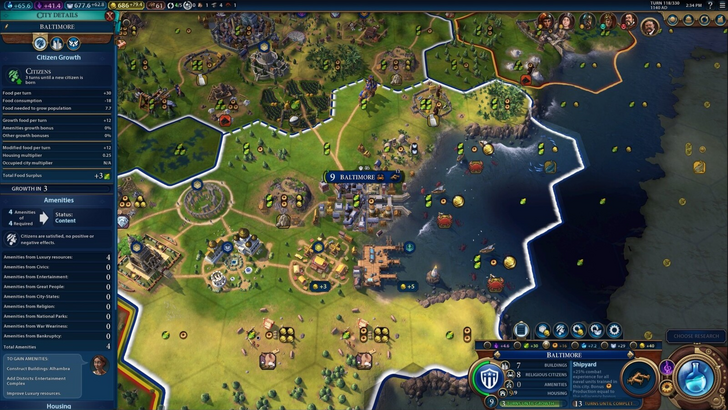
Let's examine Civ VII's resource summary UI. It effectively displays resource allocation, separating income, yields, and expenses via dropdown menus. The tabular format allows for easy tracking, with detailed breakdowns available. However, it lacks granular detail. While total resource yields from Rural Districts are shown, the specific districts or hexes aren't identified. Expense breakdowns are also limited.
In conclusion, Civ VII's resource UI is functional but could benefit from increased specificity.
Effective and Efficient Visual Indicators
Effective visual indicators use icons and graphics to convey information quickly, minimizing reliance on text. Symbols, colors, and overlays efficiently communicate important data.
Stellaris, despite its cluttered UI, uses visual indicators effectively in its Outliner. Icons clearly show the status of survey ships, and planet icons indicate resource needs.
Civ VII utilizes iconography and numerical data for resources. The tile yield overlay, settlement overlay, and settlement expansion screen are effective visual aids. However, the absence of certain lenses from Civ VI (appeal, tourism, loyalty) and customizable map pins is a source of criticism. While not terrible, there's room for improvement.
Searching, Filtering, and Sorting Options

Searching, filtering, and sorting options become crucial in complex 4X games to manage information overload. Search bars, visual filters, and sort buttons streamline navigation.
Civ VI's robust search function allows players to locate resources, units, and features on the map. Its Civilopedia also links entries to in-game instances.
Civ VII lacks this crucial search function, a significant drawback for many players. This absence significantly impacts usability, especially given the game's scale. The addition of a robust search function is highly desirable.
Design and Visual Consistency
The UI's aesthetic and cohesiveness significantly impact player experience. A visually unappealing UI can detract from even the best gameplay.
Civ VI's dynamic, cartographical style seamlessly integrates with the game's aesthetic.
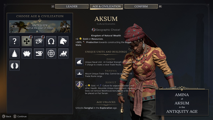
Civ VII employs a minimalist, sleek design, prioritizing refinement over vibrant visuals. While the design is not inherently poor, its subtler thematic approach may not resonate with all players. This lack of immediate visual clarity contributes to mixed reactions. Ultimately, visual design is subjective.
So What’s the Verdict?
Not the Best, But Undeserving of Excessive Criticism
Civ VII's UI, while not perfect, isn't as bad as widely claimed. The missing search function is a significant flaw, but not game-breaking. Compared to other issues, the UI shortcomings are relatively minor. While it falls short of some competitors, it possesses strengths. Future updates and player feedback can further refine the interface. The overall game's strengths compensate for the UI's imperfections.
← Return to Sid Meier's Civilization VII main article
Sid Meier's Civilization VII Similar Games

-

methinks - money for thoughts
-

ASUS AiCam
-

Haup
-

BayaM - Audios, Jeux, Vidéos
-

Hodler – Crypto Portfolio
-

Modern MCPE Houses PRO
-

Manga Reader- Best Free Manga Online & Offline
-

Baby night light - lullabies w
-

Hamara Jobs (Qjobs)
-

ReBrawl Private Server For Brawl Stars Helper
-

PCH Hookup Casual Adult Dating
-

naduu - Chat and meet people
-
1
Announcing the Bazaar Release: Date and Time Unveiled
Feb 02,2025
-
2
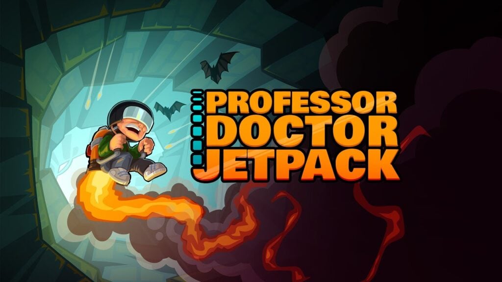
Professor Doctor Jetpack is a Pixel Art Precision Platformer Now Out on Android
Dec 30,2024
-
3

Andrew Hulshult 2024 Interview: DOOM IDKFA, Blood Swamps, DUSK, Iron Lung, AMID EVIL, Music, Guitars, Cold Brew Coffee, and More
Jan 07,2025
-
4
A demo of the fan-made sequel Half-Life 2 Episode 3 Interlude has been released
Jan 05,2025
-
5
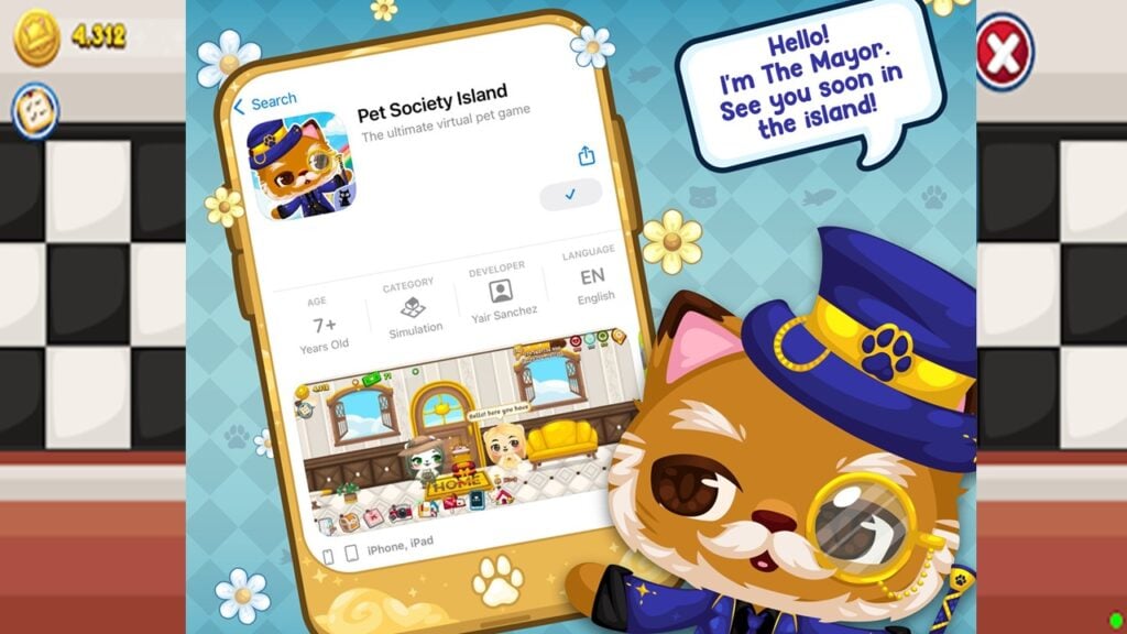
Android Welcomes Virtual Pet Haven: Pet Society Island
Jan 09,2025
-
6

Teamfight Tactics 14.14 Patch Notes: Inkborn Fables Finale
Jan 11,2025
-
7

Sword Master Story Is Celebrating Its 4th Anniversary with Tons of Freebies!
Jan 09,2025
-
8

Switch 2: Summer 2024 Launch Expected
Dec 11,2024
-
9

Marvel Rivals Unveils Season 1 Release Date
Feb 02,2025
-
10

Palworld: How To Get To Feybreak Island
Jan 08,2025
-
Download

Ben 10 A day with Gwen
Casual / 47.41M
Update: Dec 24,2024
-
Download

A Simple Life with My Unobtrusive Sister
Casual / 392.30M
Update: Dec 10,2024
-
Download

The Lewd Knight
Casual / 1210.00M
Update: Jan 02,2025
-
4
Kame Paradise
-
5
I Want to Pursue the Mean Side Character!
-
6
Little Green Hill
-
7
Evil Lands: Online Action RPG
-
8
Lost Fairyland: Undawn
-
9
Hero Clash
-
10
Bar “Wet Dreams”